Accessibility and inclusion through Digital Signage
Inclusion and accessibility are crucial concepts in today’s world. Businesses and organizations are increasingly adopting these principles, and their communication strategies must follow suit. Traditional flyers and posters often fall short in meeting the diverse needs of all users. Digital Signage, however, offers a powerful solution.
Imagine being handed a flyer that you can’t read or encountering a poster placed so high that it’s illegible. Frustrating, isn’t it?
Now, picture a screen that reads its content aloud for you or an interactive kiosk where information is displayed exactly at your eye level. A far better experience, right?
This is why Digital Signage is an accessible communication tool capable of meeting the needs of all users. In this article, we’ll explain how you can make your business communication inclusive through Digital Signage. If you already have a system in place, you’ll find valuable tips for adapting your multimedia content to ensure everyone can access it.
One screen, endless options
When choosing hardware for Digital Signage, the options are plentiful: wall-mounted screens, floor-standing multimedia kiosks, interactive tables, or horizontal boards. But how can you ensure these setups are accessible to everyone? Below are some practical guidelines to help you achieve proper installation based on your choice.
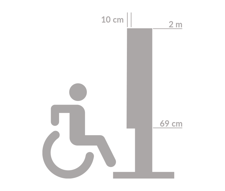
In general, the lower edge of the screen should be no less than 67 cm (26 inches) from the ground, while the upper edge should not exceed 2 meters (6.5 feet). This range ensures content is easily visible from both high and low positions.

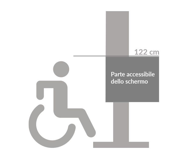
Clearly, for touch screens, interactive zones should be centered at approximately 122 cm (4 feet) from the ground for optimal usability.

Reserve the top and bottom areas of the screen for scrolling news, weather updates, or time displays—information that requires only a quick glance.
Wall-mounted screens
For touch-enabled displays, ensure the screen extends no more than 10 cm (4 inches) from the wall. This allows wheelchair users to approach and interact comfortably.
Interactive tables and multimedia lecterns
For devices like interactive tables, the screen should be tilted at an angle of 15–20° to facilitate content readability and touchscreen use. The supporting structure should be designed to allow easy access for wheelchair users. For instance, avoid cube-like steel bases that obstruct accessibility.

Accessible content: beyond the hardware
Accessibility is not only through the design and installation of monitors and multimedia totems. Creating accessible content is essential for everyone to enjoy the benefits of digital signage. What makes content accessible?
- Legible texts and images
- Audible visual content
- Subtitles for audio content
- Gesture recognition for interaction
- Portable Information via QR Codes
1. Legible texts and images
Texts, numbers and symbols (as well as images) must always be perfectly readable by anyone. There are various vision problems and difficulties associated with reading a text. Whatever it is, there must never be any obstacles to reading your content. For this to be possible, three aspects must be taken into account: contrast, font type and size. Let us go into more detail.
Constrat Ratio
Contrast is the difference in perceived brightness between two colours. It ranges from 1:1 (white text on a white background) to 21:1 (black text on a white background). It is a parameter often used to assess the accessibility of a website and can therefore also be applied to digital signage monitors, given the large size of text.
The higher the contrast ratio, the greater the readability of a content and consequently its accessibility. A value between 4.5:1 and 7:1 ensures that the information you want to convey is clear and readable. We leave here a free resource that allows you to evaluate the contrast ratio between text and background colour that we are sure you will find useful https://colorable.jxnblk.com/
But why is contrast so important? Because there are different forms of colour blindness and they are more widespread than people think. Those who suffer from Protanopia or Deuteranopia, for example, do not perceive red and green respectively. Then there are those who have monochromatic vision or cannot distinguish yellow from blue. This list should be enough to make you realise that poorly calibrated contrast can make it difficult to read and distinguish images.
But how can I tell if the colours and texts in my content are accessible to everyone? We leave you here a link where you can find a simulator to see how a person with colour blindness https://www.color-blindness.com/coblis-color-blindness-simulator/
Fonts: size and typography
The choice of fonts is just as crucial as the contrast. Although it is not obligatory to use sans-serif fonts, it is true that many people find them more readable, especially in smaller texts. Our advice is to use serifs only for titles and large texts. Instead, do not use ‘decorative’ fonts. They can be aesthetic elements, e.g. for initials or a letter head, but the information that your digital signage needs to convey must be written simply and cleanly.

So which one to use sans-serif? They are not all the same. Within the same category there are more or less readable ones. We recommend that you choose one with characters that are easily distinguishable visually. Avoid those where, for example, capital ‘i’, lower case ‘l’ and ‘1’ are all represented in the same way or those that use the same mirrored symbol to represent different characters such as ‘b’ and ‘d’. You will make life easier for everyone.
Finally, we cannot fail to mention the space between the letters. The basic principle here is very simple. The less space between the letters, the lower the readability. Too little space between the letters prevents people from recognising the individual letters and thus from reading what is written correctly. The shapes get mixed up, the lines become one shape and thus the meaning of the words is lost.
2. Audible visual content
With Digital Signage you can offer your audience a very wide range of content. Images, videos and graphics are just a few examples. Not only that. Thanks to interactive experiences, people can interact directly with the information displayed.
With a view to building accessible communication, everyone should be able to interact with monitors and totems, even those with visual or hearing impairments.
How to do this? You have to be able to combine different types of content in a smart way. Each message must be easy to read, listen to and interpret. For example, for blind or visually impaired people, an audio version of the images or texts must always be available. Recorded descriptions that allow the user to understand what is represented on the screen.
3. Subtitles for audio content
For videos or podcasts displayed via Digital Signage, provide subtitles for users who are deaf or hard of hearing. Consider also incorporating sign language interpretation for additional accessibility.
4. Gesture Recognition for Interaction
By now, most digital signage solutions have the possibility to implement modern technologies within them that use AI (= Artificial Intelligence), AR (= Augmented Reality) or gesture recognition sensors.
These kinds of extras are a great opportunity to increase the accessibility of your content. In this way, people with physical disabilities can still use touch screens simply with gestures.
5. Portable Information via QR codes
This last point may seem obvious but you will soon discover that it is not. In fact, although all ADA standards are met, there may still be some people who have problems with remote reading.
To meet their needs as well, always remember to provide an easily scannable QRcode that transfers the content of the screen to the user’s smartphone so they can read it at close range.

ON/OFF Accessibility Features
During the design phase of your Digital Signage system, include a set of user-friendly controls to adapt the display for different accessibility needs. Consider adding:
- A button to activate high-contrast mode.
- A control to reposition icons for wheelchair users.
- Options to adjust text size (small/medium/large) for improved readability.
Universal Symbols and Icons
Icons and symbols are extremely useful to use in monitors and multimedia totems. Often more readable than a text, they help to immediately understand its meaning. An exclamation mark indicates danger or caution, a skull symbolises a high risk, an arrow indicates a direction, and so on.
This ease of reading, however, only exists if a universally recognised representation of that icon is used. It is good to prefer symbols that exist everywhere while maintaining immediately recognisable colours. Red for danger, green for emergency exits, etc.
Accessibility in Digital Signage as in any other context should aim to promote the autonomy of all users. We hope that this has emerged from our article and that you now have a somewhat broader overview of all the actions that can be put into practice to make the communication of the future truly accessible.